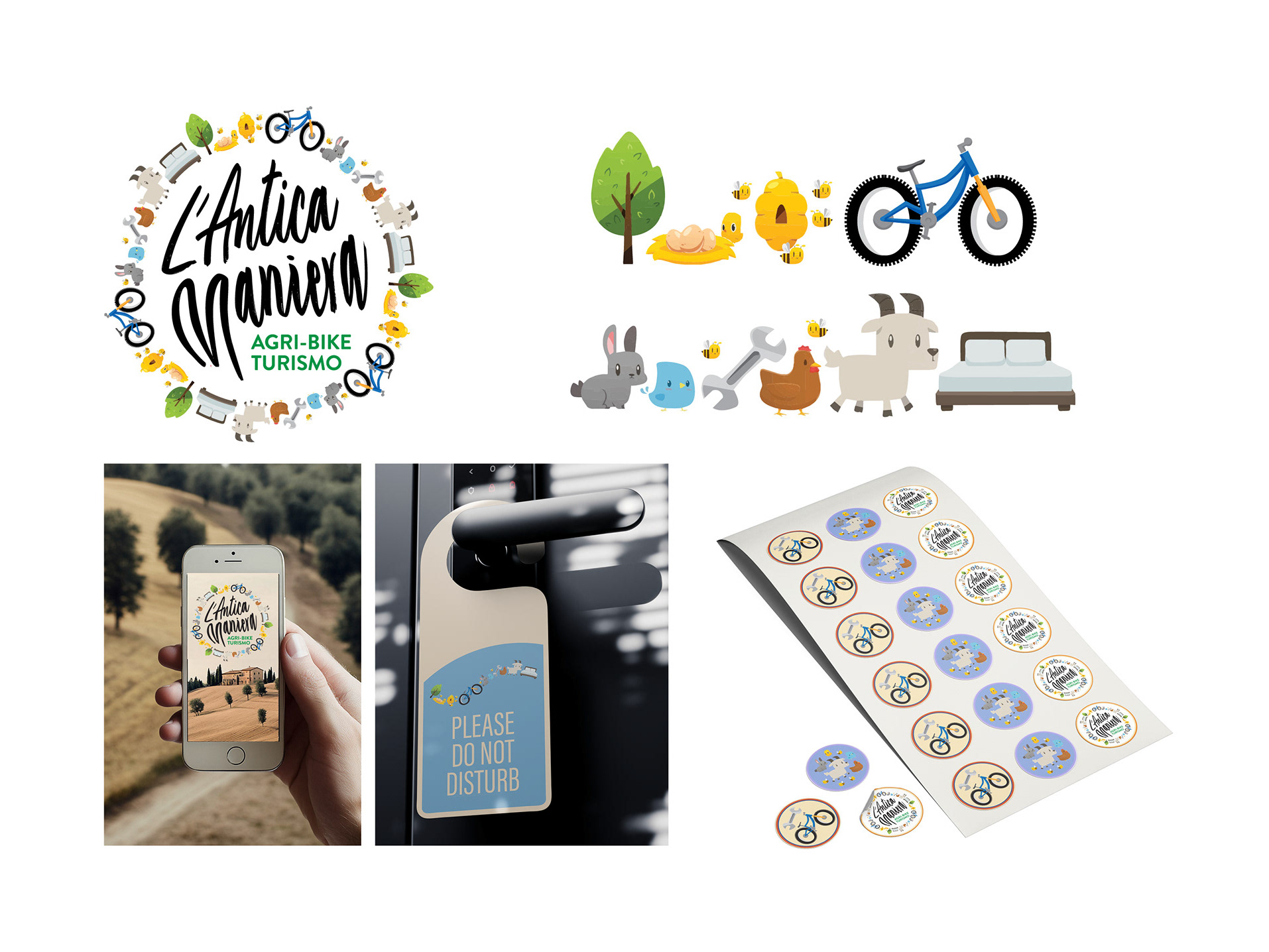
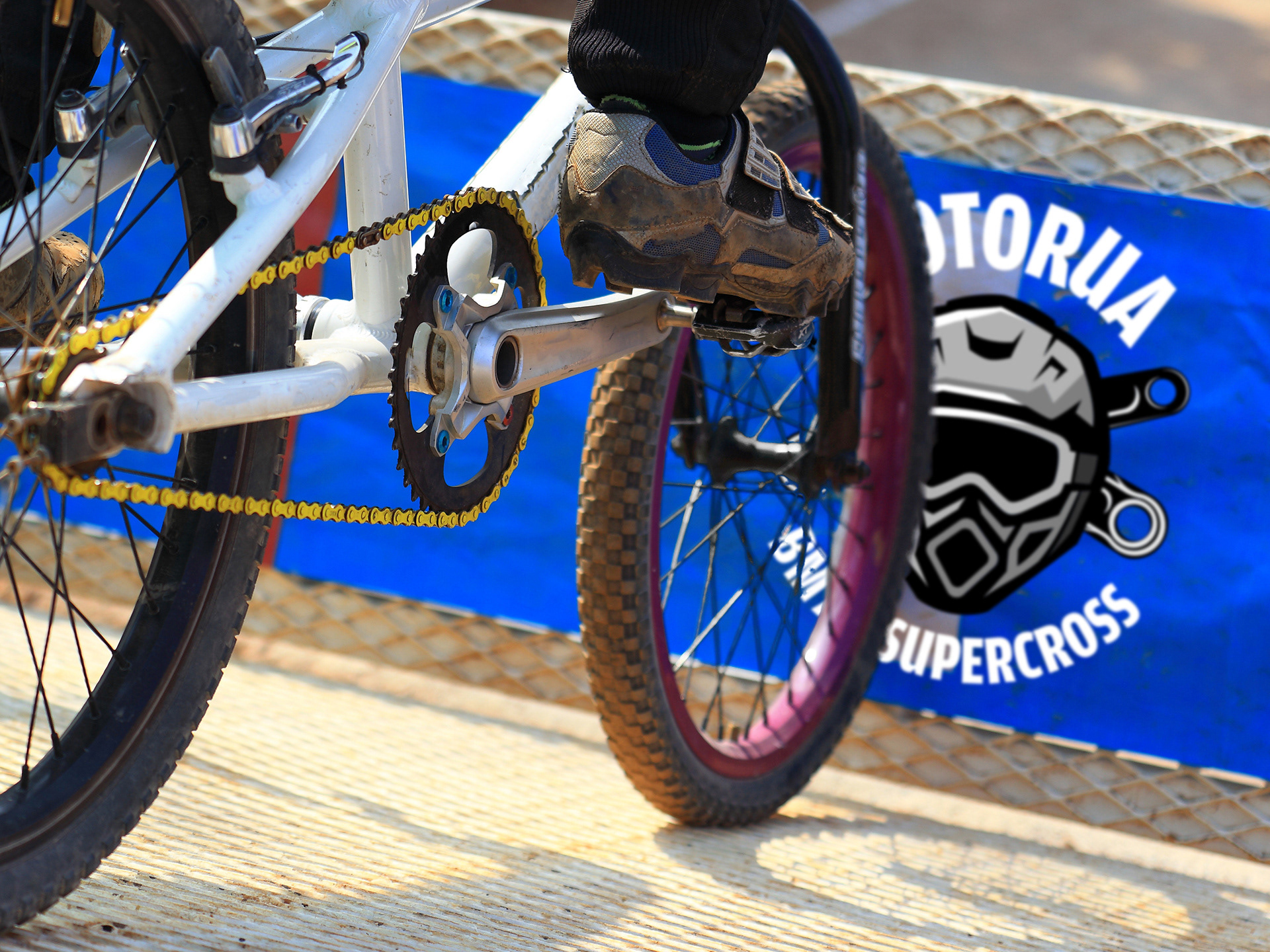
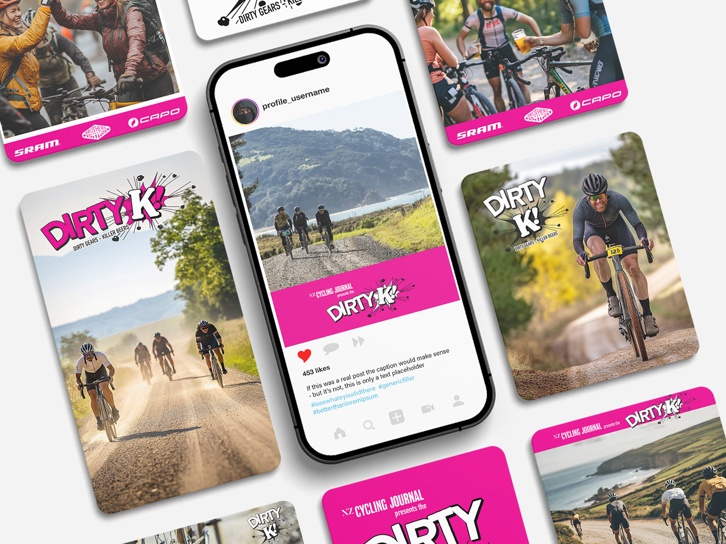
Development of brand identity for cycling and running events.
Independent icons for each event and the parent brand, while retaining a clear stylistic link.
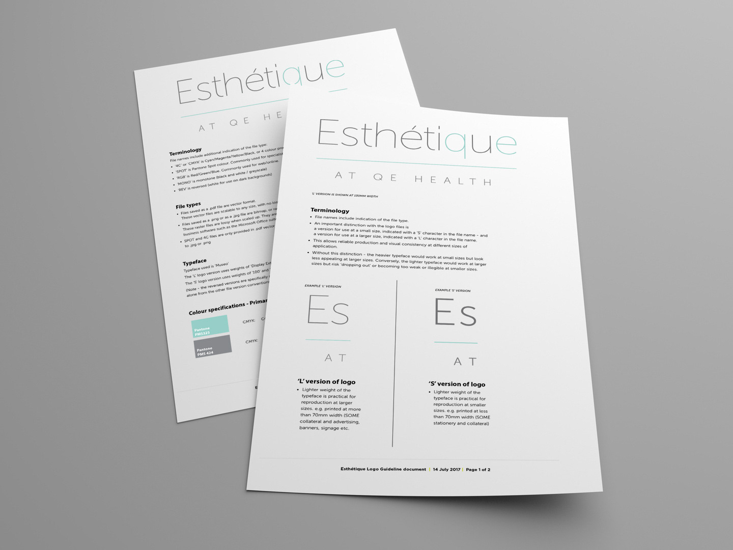
Rationalisation of one consistent font and the same underlying structure for all logos makes practical execution simple. i.e. they fit together seamlessly, in any combination.

