The brief: Design a brand identity for a governing body, its facility and two of its branded events.
The challenge: Logos for each of the brand focuses must have a clear link - while being strong enough to stand on their own. The scenario is similar to many multi-faceted brand structures who have different touch points for their varied audiences.
The solution: Design of a series of graphics based around a single concept - with a link to kayak paddling, meeting the requirements of a clear brand identity with legibility, originality and recognition.
How: A graphic representing an aerial view of a kayak in turbulent white water. Different versions for each brand application, utilising colour to ensure differentiation.
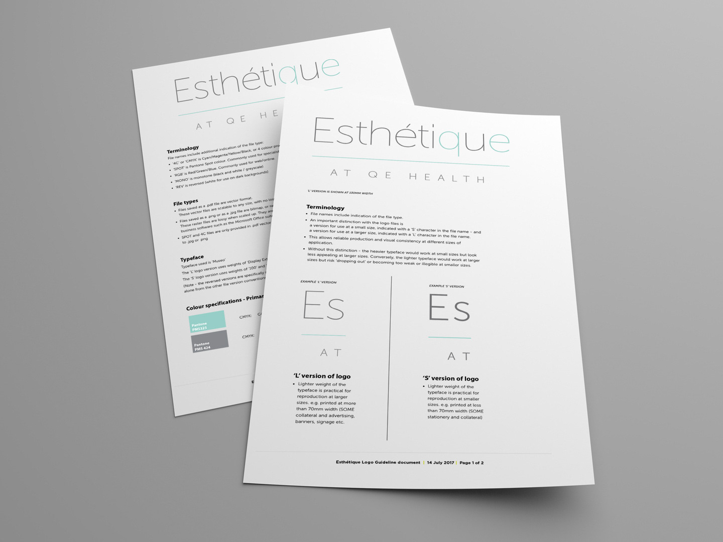
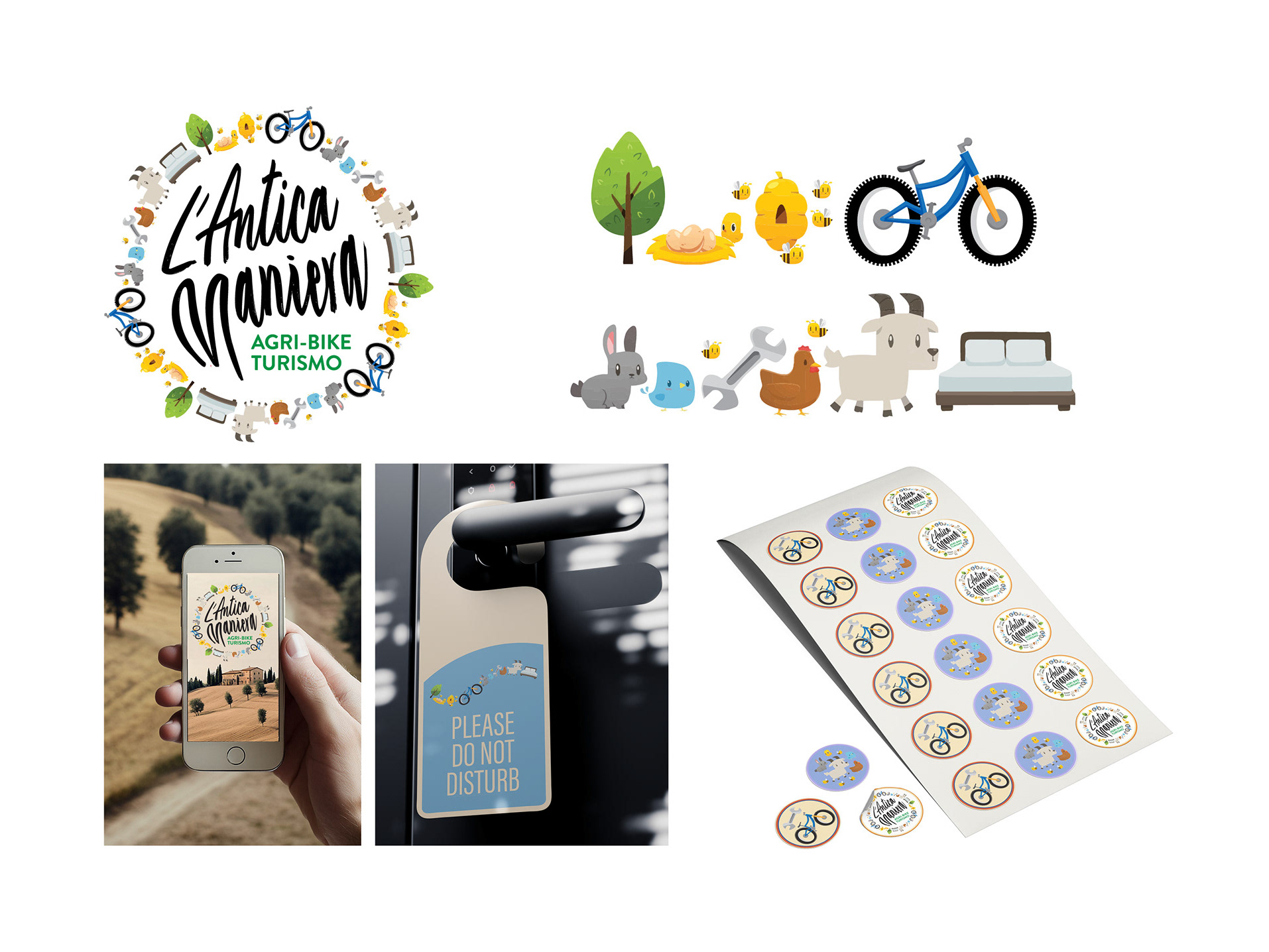
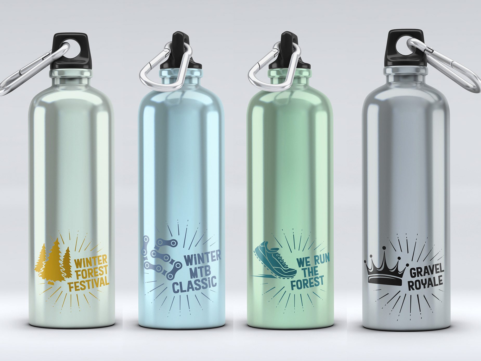
The second stage of identity development utlised the core elements of the logo versions with application to different outputs - documents, advertising and collateral.
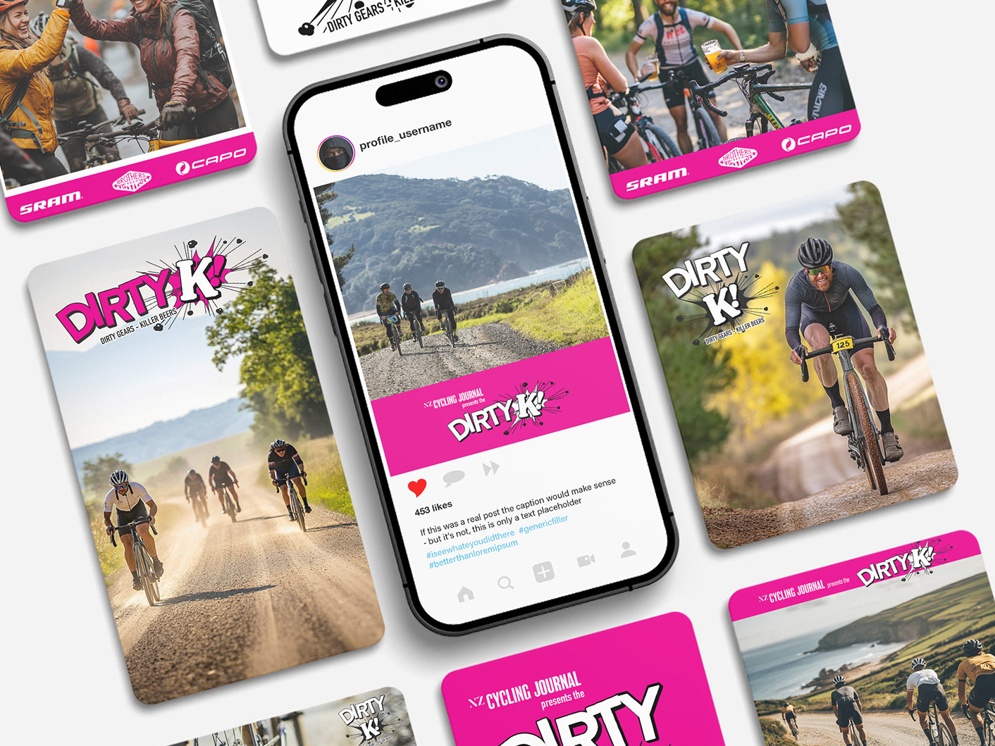
Consideration was given to working with existing sponsors, with collaborative ways to incorporate sponsor logos. These are designed as a starting point to begin conversations with the sponsors - showing them from the outset that the Paddle Sport brand visuals are flexible to work smoothly with their logos.
It also explored the flexiblity of the brand visuals with environmental branding: signwriting buildings.
