The brief: Design a logo for Rotorua BMX and Supercross.
The challenge: A large part of the club's particpants are children and their supporting families. A high profile part of the club's focus is elite level youth and young adult racing. The logo neesd to appeal to the youthful bulk of the club's members while still being professional and distinctive to identify the club on a global stage when bidding for world-cup tier events.
The solution: Multiple presentations with the client allowed the key point of contact person to share clearly written rationales for concepts. This engagement ensured they understood the critical thought of the logo's appeal across a wide spectrum of target audiences.
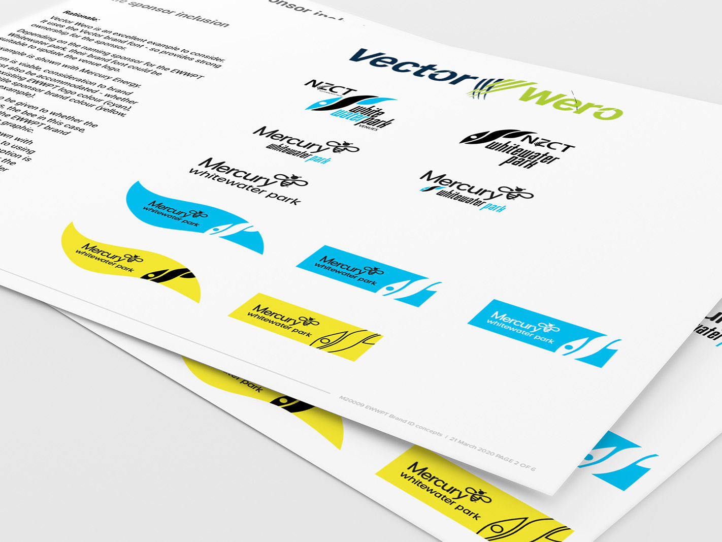
How: Due to the volunteer nature of the club's key stakeholders, iteration of a wide range of potential designs were presented and discussed to ensure they understood and appreciated the reasoning behind each concept. This process brought them 'along for the journey' with their feedback adding legitimate input to the final selected concept.
The final logo is a badge-like structure, with enough detail in the helmet and crossed cranks to provide interest when seen at large sizes, like painted on the track's start ramp. While still being a recognisable shape when appearing at small sizes in sponsorship documents and advertisements.
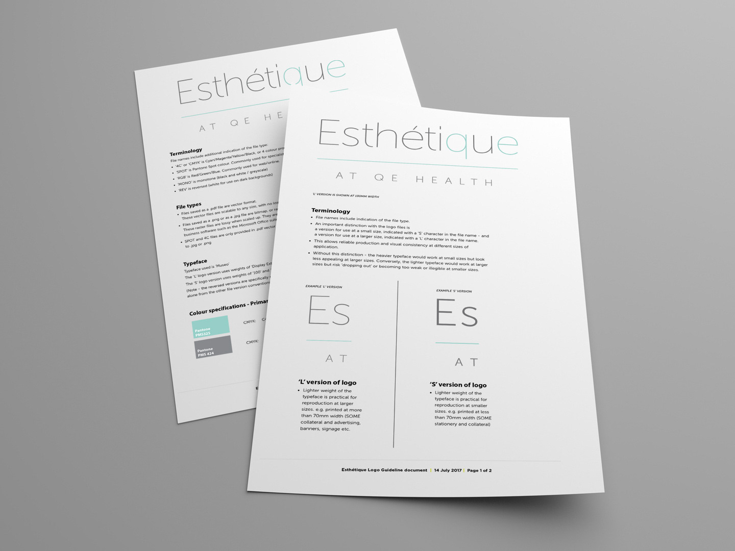
The final logo package extended to include templated sign formats, along with simple and clear instructions for use. This puts control of the brand application in the hands of the club, to easily work with signwriting service providers without needed designer input.
