The brief: Design a logo for Jumpstart - a programme within a corporate environment. It needs to be bright, fresh and energetic. It needs to align with the programme's goal of developing and commercialising ideas in a kickstarter-like incubator context.
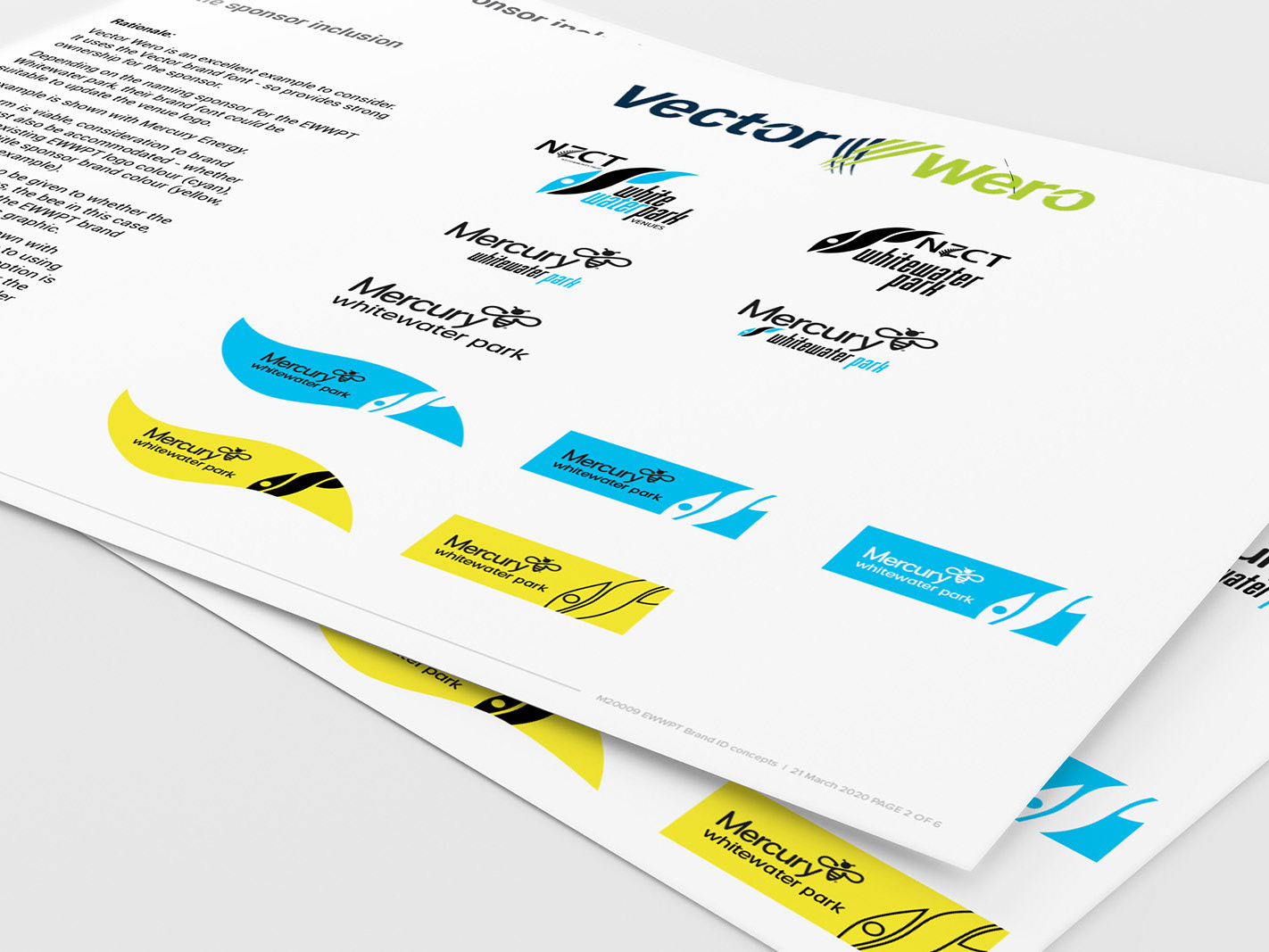
The solution: Two concepts were presented with rationale and visualisations of potential variation within each concept.
But first: Analysis of stakeholder branding to ensure the Jumpstart logo doesn't inadvertently appear to align too closely with any one stakeholder at the expense of the others. The Jumpstart logo needs to be clearly independent of its stakeholders. However, it does need to align with the parent organisation's conference, seminar and event visual identities. The common theme is identified as being a circular device, working as a lockup for the logo.
The approved logo uses the shape of concept one, with the colour palette of concept two. An excellent example of why it's worthwhile 'showing my work' with clients to get their engagement and feedback in a truly collaborative manner.
