Project background
The Whakarewarewa Forest Loop (WFL) is an ambitious development to reinforce Rotorua's world-class mountain biking value. It is the culmination of years of planning and relationship building, driven predominantly by Project Managers at Rotorua Lakes Council working alongside the iwi landowners and forestry management interests. The WFL consists of mostly easy (grade 2) trails with a few short intermediate (grade 3) sections over its 33km length. It is designed to appeal to riders of almost all ages, experience and fitness. It takes three to five hours for most riders, travelling through a variety of forest types.
The Whakarewarewa Forest Loop (WFL) is an ambitious development to reinforce Rotorua's world-class mountain biking value. It is the culmination of years of planning and relationship building, driven predominantly by Project Managers at Rotorua Lakes Council working alongside the iwi landowners and forestry management interests. The WFL consists of mostly easy (grade 2) trails with a few short intermediate (grade 3) sections over its 33km length. It is designed to appeal to riders of almost all ages, experience and fitness. It takes three to five hours for most riders, travelling through a variety of forest types.
The Design aspect
My role as a contracted specialist designer was to develop extensive sign design systems for the entire loop and supporting infrastructure. From the prerequisite trail directional wayfinding signs, to less obvious elements ilke interpretive panels and mapping visualisations.
My role as a contracted specialist designer was to develop extensive sign design systems for the entire loop and supporting infrastructure. From the prerequisite trail directional wayfinding signs, to less obvious elements ilke interpretive panels and mapping visualisations.
____________________________________________________________
A collaborative approach
When I became involved with the project the council's in-house designer had already implemented extensive workshop and design development of the core brand identity element with the iwi landowners. Aspects of the simple 'M' design were locked in, but it needed extensive refinement and extension to meet the needs of an effective sign system.
When I became involved with the project the council's in-house designer had already implemented extensive workshop and design development of the core brand identity element with the iwi landowners. Aspects of the simple 'M' design were locked in, but it needed extensive refinement and extension to meet the needs of an effective sign system.
A key part of this was respecting the client and their stakeholders with an inclusive, collaborative approach. Not merely showing preferred concepts, but explaining working designs, to build understanding and trust in the design process.
Photographic renders
Mocking up key sign designs on real photos on site of the WFL is invaluable in 'bringing the client along for the journey'. Helping them understand not just the user interface of designs, but the more important user experience of how riders on the WFL would engage with the sign system.
Mocking up key sign designs on real photos on site of the WFL is invaluable in 'bringing the client along for the journey'. Helping them understand not just the user interface of designs, but the more important user experience of how riders on the WFL would engage with the sign system.
Planning, planning and more planning
I am a visual thinker, which unsurprisingly is a great way to communicate complex information with clients. My identification of key sign requirements and the cross referenced places different styles would be needed provided a solid plan to work from. Addionally, it provides a deep level of detail for costing purposes of sign production and installation - which is not a trivial prospect.
I am a visual thinker, which unsurprisingly is a great way to communicate complex information with clients. My identification of key sign requirements and the cross referenced places different styles would be needed provided a solid plan to work from. Addionally, it provides a deep level of detail for costing purposes of sign production and installation - which is not a trivial prospect.
Wayfinding maps
The primary Project Manager rightly identified particular areas with difficult navigation for riders. Whether at busy hubs with many other trails and facilities, or trail alternatives to provide riders with a choice of trails to best suit their riding ability at given points of the WFL.
The primary Project Manager rightly identified particular areas with difficult navigation for riders. Whether at busy hubs with many other trails and facilities, or trail alternatives to provide riders with a choice of trails to best suit their riding ability at given points of the WFL.
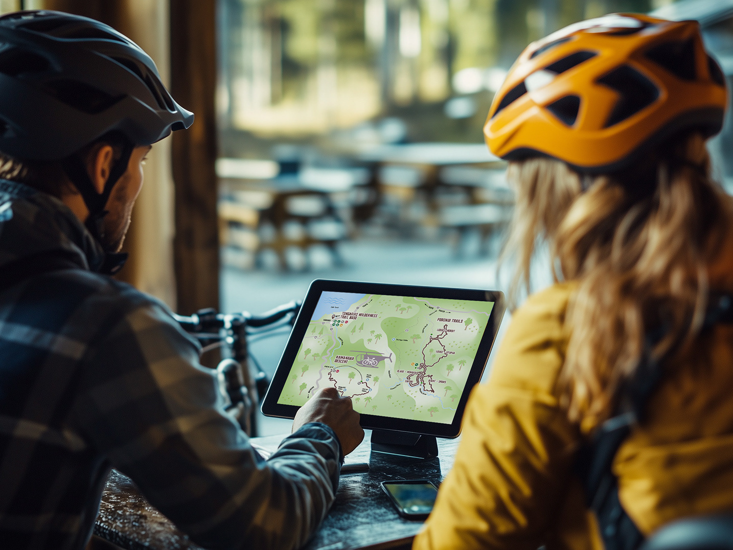
Wayfinding maps are designed with the bare minimum of detail - simple and clean to clearly convey only critical information for the rider to make a decision at that point of their ride.
Quick and dirty renders
Not beautiful, but highly effective. As we progressed through the project there were areas where the environment the signs appear presented challenges. Mock ups of signs over photos of the sites allow critical thinking of how to best work around those challenges.
Not beautiful, but highly effective. As we progressed through the project there were areas where the environment the signs appear presented challenges. Mock ups of signs over photos of the sites allow critical thinking of how to best work around those challenges.
An example is a major trail junction with a large number of existing signs which had been installed over time. Ideally we would have designed a single cohesive sign unit encompassing all the information. That was not feasible, due to different stakeholder ownership of some existing signs.
Planning visually how we could achieve the best possible result given the constraints isn't going to win any design awards, but it does ensure the main priority - to make the riders' user experience as clear and easy to use as possible.
Production and version control
This is only a part of the entire sign system. The main takeaways here are clarity of communication - essential for the users' experience and consistency of brand style. Becuase many of the signs went through necessary revisions and refinements accurate version control was critical to manage the many pieces of artwork outputs.
This is only a part of the entire sign system. The main takeaways here are clarity of communication - essential for the users' experience and consistency of brand style. Becuase many of the signs went through necessary revisions and refinements accurate version control was critical to manage the many pieces of artwork outputs.
If you're wondering why the emergency sign is the only one to break from the brand style with a white background, good question! It is a small sign style mounted on the back of hundreds of posts in the forest. The posts support the main trail signs. So at the size it had to appear (on 100mm wide posts), and considering when user's need to use them they would be in a difficult situation with an emergency, absolute legibility was the primary goal. Dark text on white is highest contrast and most legible - this is a small example of when breaking brand style rules is the correct thing to do.
Extension
A related offshoot of the WFL branding was to develop a similar sister brand sign system for forest trails and facilities which aren't specifically for the WFL. This is an ever expanding sign system as designs are developed to replace signs thare are outdated and to improve user experience throughout the forest network of trails.
A related offshoot of the WFL branding was to develop a similar sister brand sign system for forest trails and facilities which aren't specifically for the WFL. This is an ever expanding sign system as designs are developed to replace signs thare are outdated and to improve user experience throughout the forest network of trails.
