Every year Red Stag Timber provide a diary to their clients. It is no token gesure though, there are upwards of 30 pages of valuable industry reference information in the first section of the hardcover diary.
The cover changes each year, keeping the look fresh while retaining relevance to the brand. As one of the concepts pitched to the client in this round a stylised wood emboss effect graphic was included alongside more conservative photographic cover options. With a rationale to highlight the benefits of the bold design, the client signed off to proceed.
Manipulation of the image was done at high resolution using Photoshop at an oversize scale. This enables repurposing of the design at a later stage, if needed. I could see this as being worthwhile as the concept would transfer effectively to large format display signage such as trade show booths.
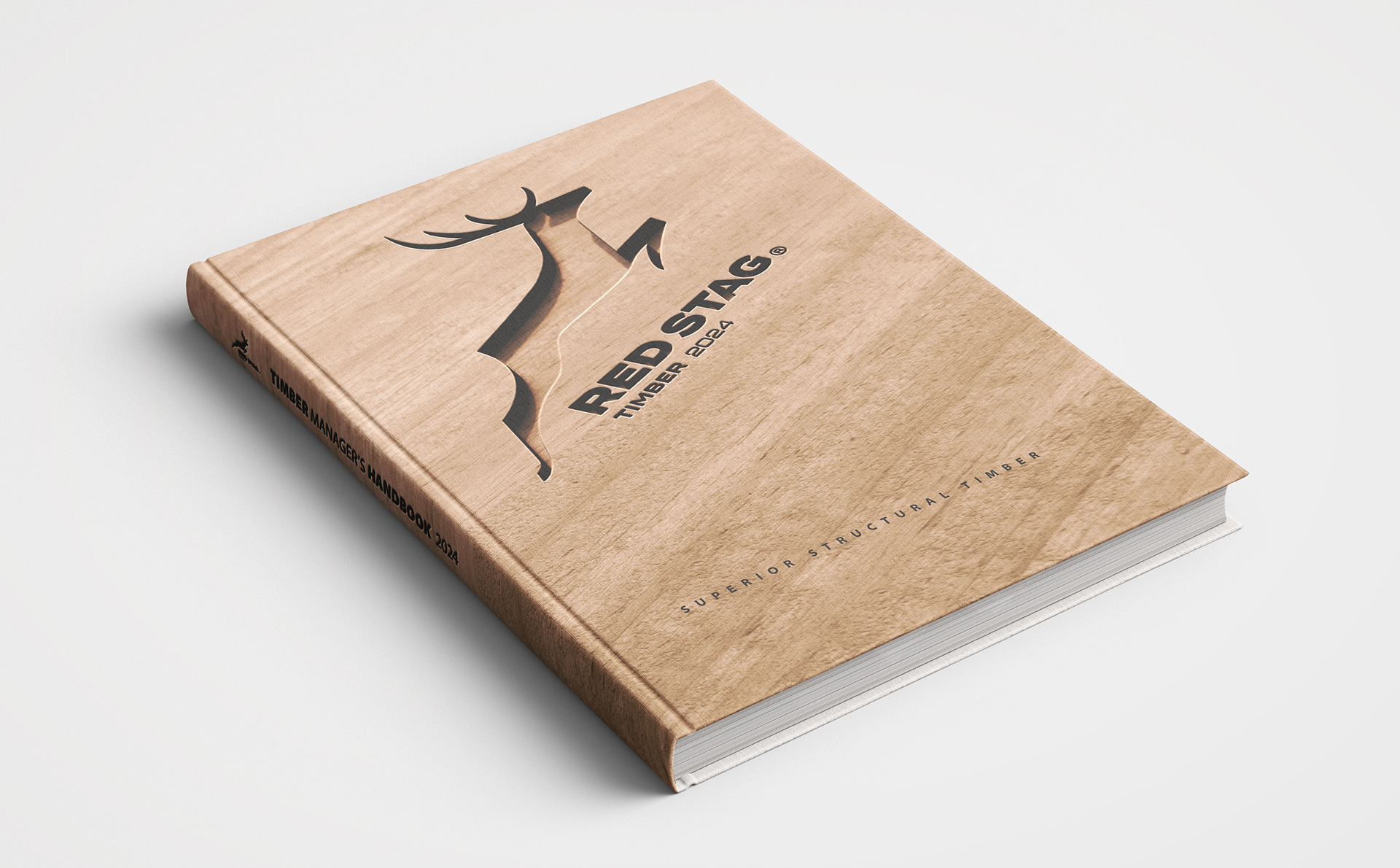
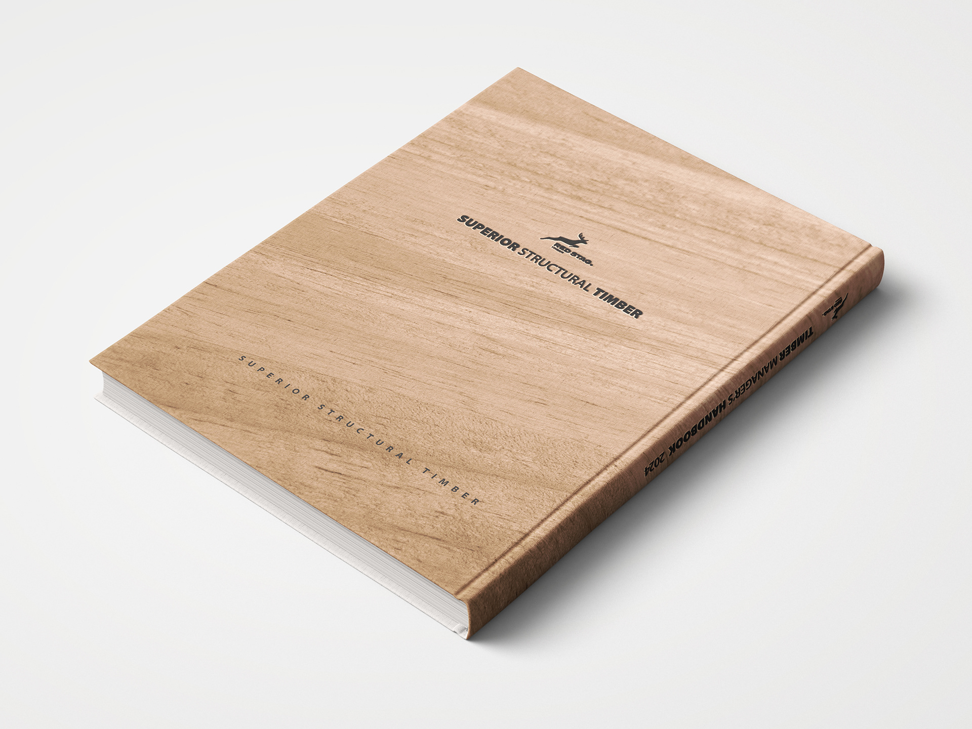
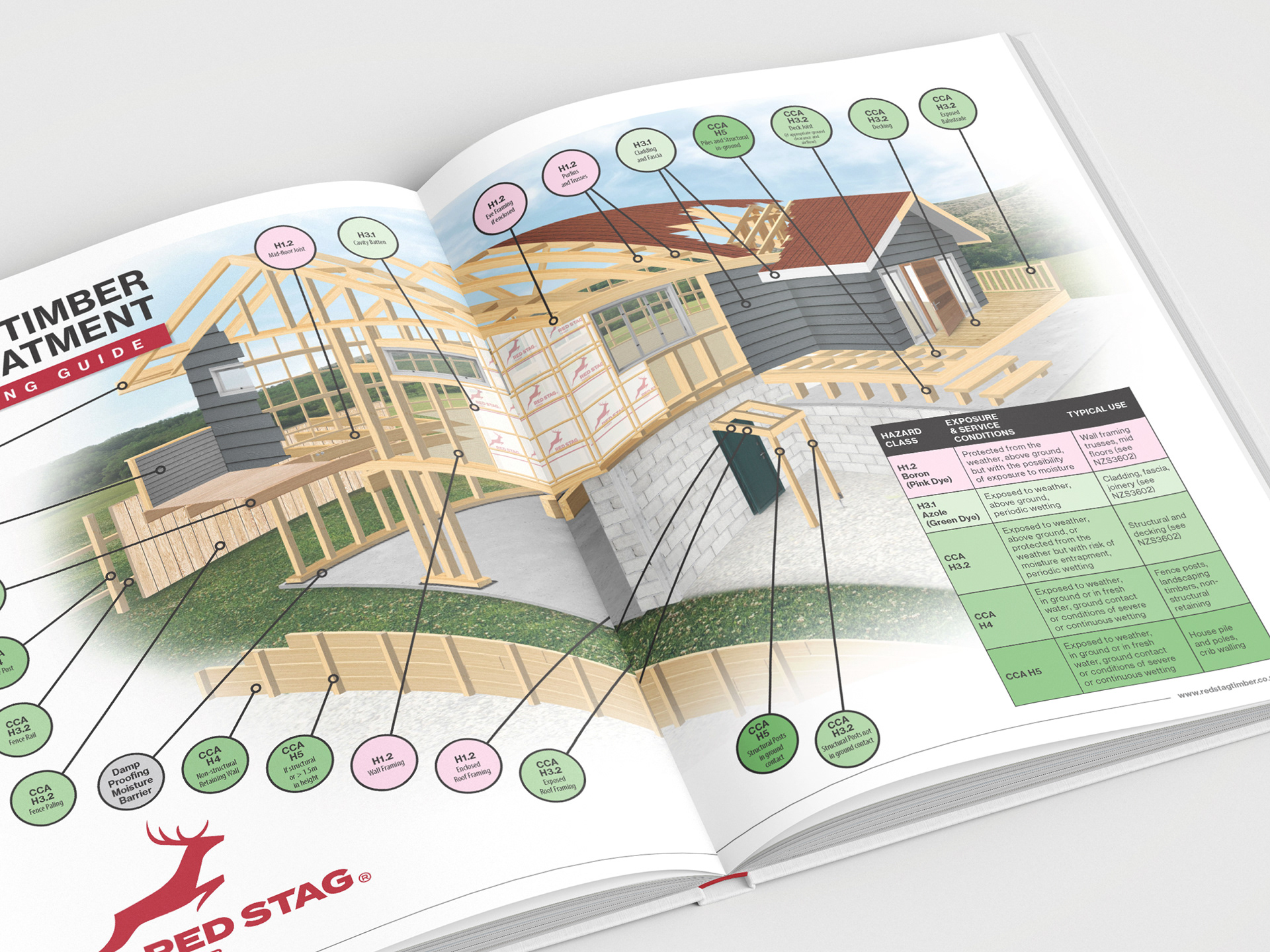
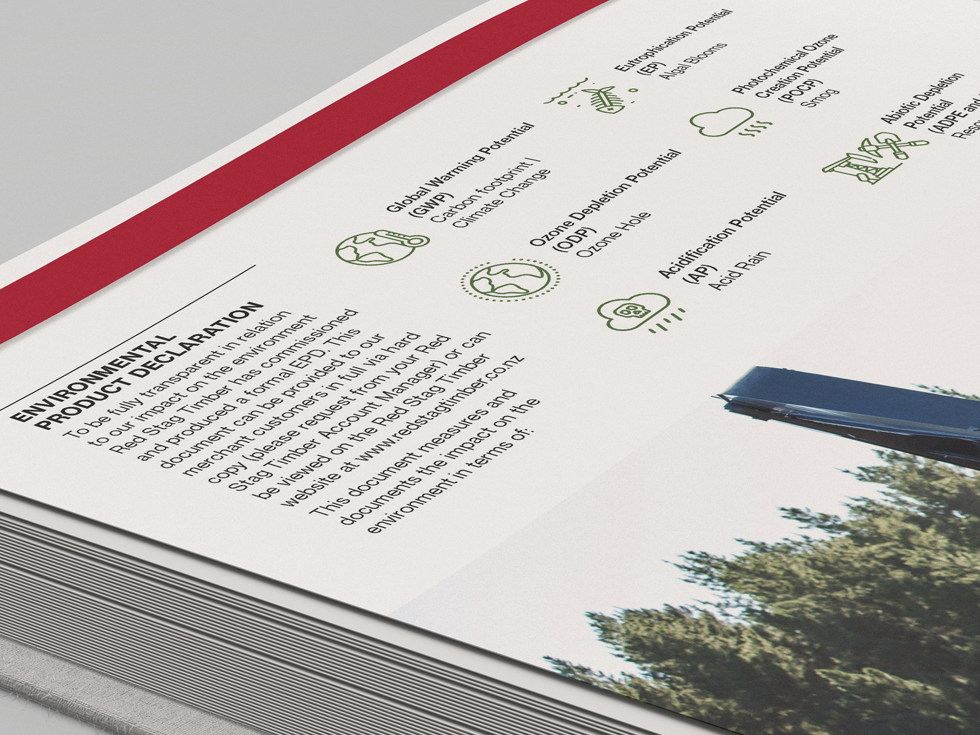
This is not a glossy marketing collateral. Well, it kind of is, but it's also a pragmatic functional resource for professionals working in industries that involve timber. To that end it's a valuable resource delivered in an annually updated format of a diary with these informative pages included.
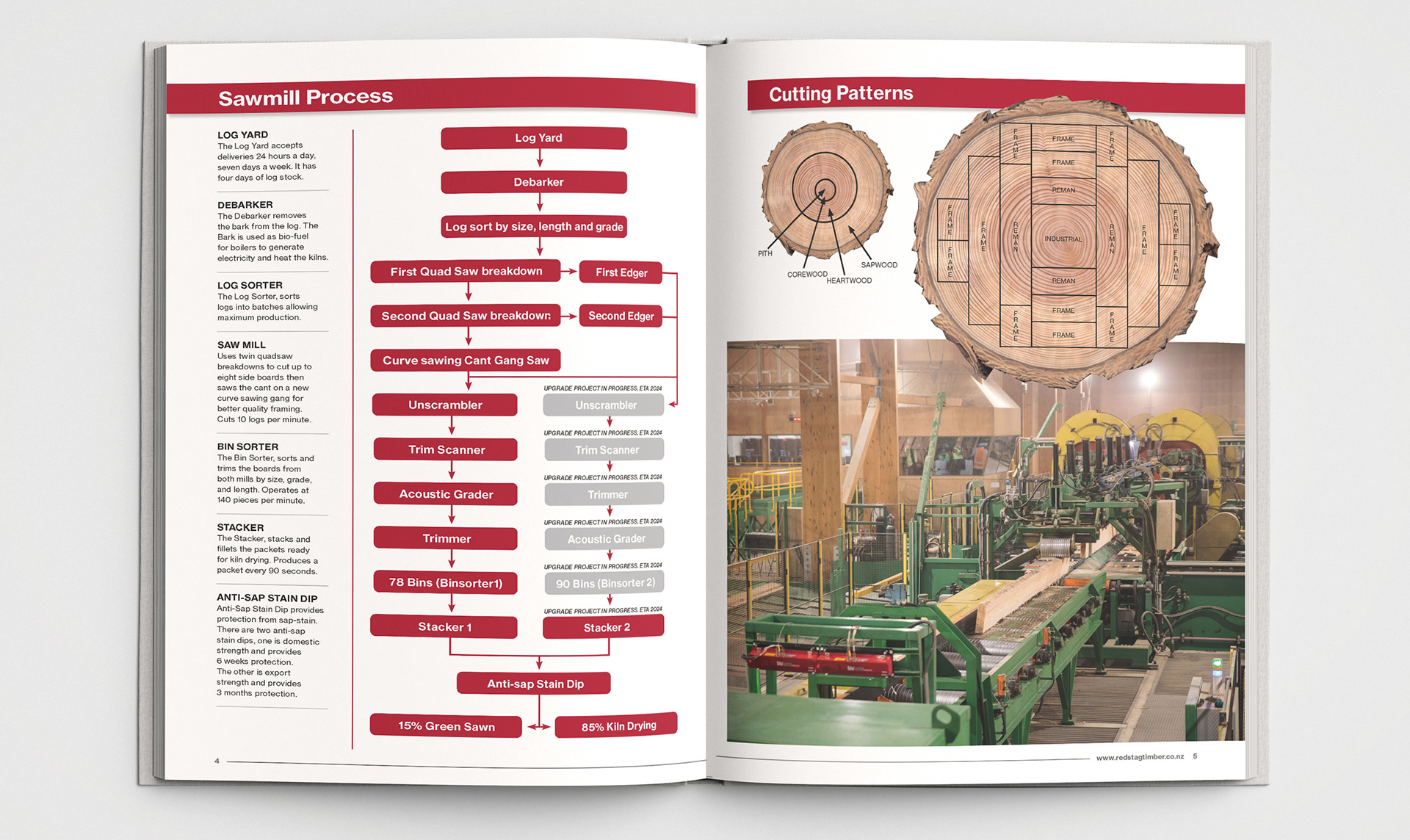
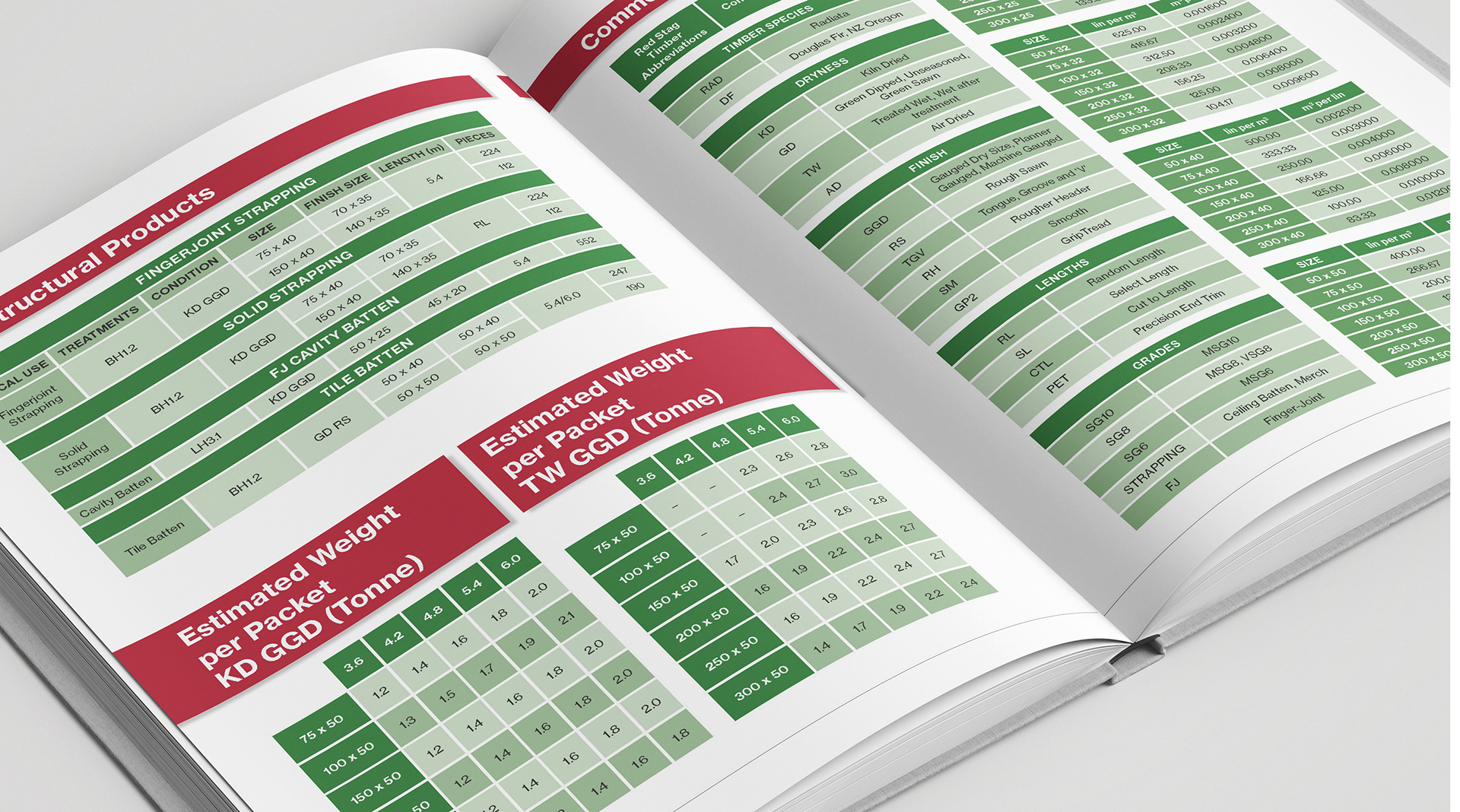
Where appropriate, icons are utilised to ensure key information is easily read at a glance, instead of being buried in blocks of text.
Highly detailed infographics included a bespoke illustration to showcase the applications of all the client's types of timber to a residential house build.